使用box-shadow
1
2
3
4
5
6
7
8
9
10
11
12
13
14
15
16
17
18
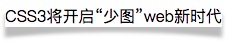
19.box-shadow {
float:left;
position:relative;
box-shadow:0 10px 5px rgba(0,0,0,.3);
}
.box-shadow:after {
position:absolute;
bottom:-29px;
left:0;
overflow:hidden;
background:#fff;
width:100%;
height:15px;
content:'';
border-radius:50%;
box-shadow:0 -10px 5px #fff;
}
<div class="box-shadow">CSS3将开启“少图”web新时代</div>
使用border
1
2
3
4
5
6
7
8
9
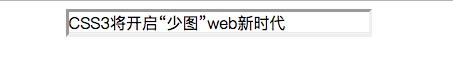
10.border-inset {
width: 300px;
margin: 0 auto;
border-width: 3px;
border: inset;
box-shadow: inset 0 -1px 0 rgba( 255, 255, 250, 0.6), inset 0 -2px 0 rgba( 0, 0, 0, 0.1);
}
<div class="border-inset">CSS3将开启“少图”web新时代</div>